Olathe Health 

Olathe Health Logo

How did we evolve a treasured brand to make it as modern as the healthcare they provide?

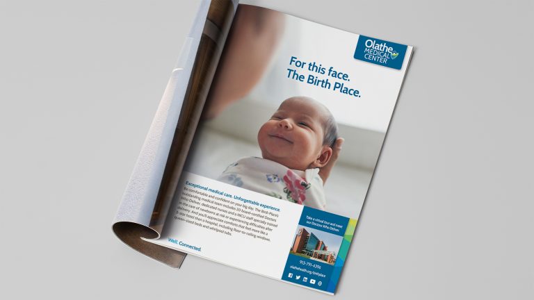
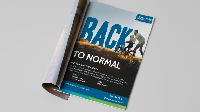
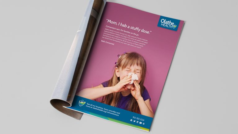
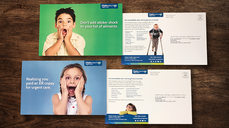
What’s wrong with the image of a friendly community hospital that delivers personalized care? Nothing, unless it overshadows advanced technology and expertise, and a large network of clinics and specialty services. That’s precisely what we faced as we positioned Olathe Health for success in an increasingly competitive healthcare environment. Rather than abandoning their high-touch heritage, we embraced it as we refreshed their brand with a new logo, tagline, clinic branding and cross-channel hospital advertising campaign.

Logo

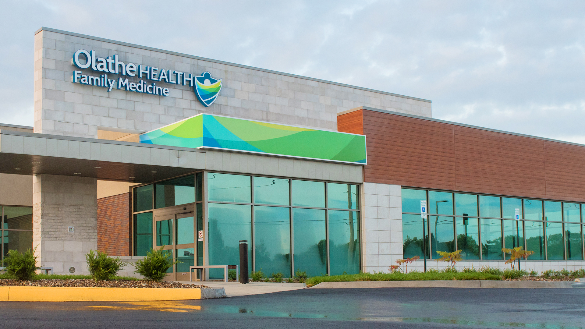
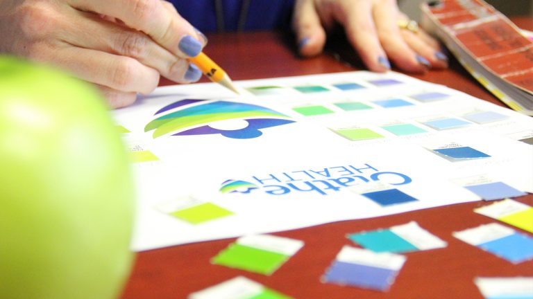
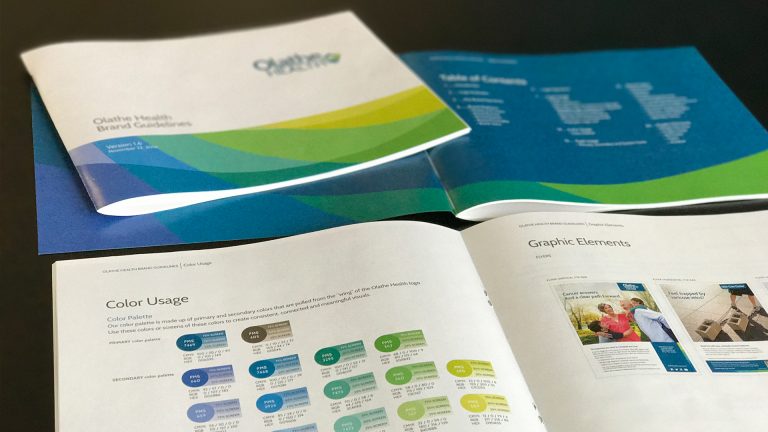
We recommended shortening the name to Olathe Health and updated the logo design, incorporating bright colors supporting Olathe Health’s brand promise of community health. A new tagline emphasized the tie between the many clinics, practices and outpatient services.
ORIGINAL LOGO
Olathe Health System Old Logo
NEW LOGO
Olathe Health System New Logo
TAGLINE
Olathe Health System Tagline - Well. connected.
SERVICES
Brand strategy
Creative development
Copywriting
Art direction
Production
Media planning and buying
Telly AwardHealthcare Advertising Award
2021, 2020, 2019, 2017 Healthcare Advertising Awards
2018, 2016, 2005, 2004 Telly Awards

TV

The new branding came to life in a cross-channel hospital advertising campaign

Clinic Signage

We elevated the visibility of the many Olathe Health practices and emphasized the tie to the larger health system
Olathe Health Family Medicine - Exterior of building

Print and Outdoor

The brand refresh included a new look and feel for service line, clinic and hospital campaigns